Tuesday, December 6, 2011

imagick.so undefined symbol error on PHP 5.3

Background info: Runnind CentOs 5.5 (and 5.7 on another machine) with PHP 5.3.8.

After doing a "pecl install imagick" I was getting the following error, and imagick wasn’t showing up on phpinfo():

php: symbol lookup error: /usr/local/lib/php/extensions/no-debug-non-zts-20090626/imagick.so: undefined symbol: MagickWandGenesis

This thing was bugging me for weeks! But I finally got it working. The brunt of it is that you should use imagick-2.3.0 instead of the 3.x.x version. Here is what I did:

# yum install ImageM* netpbm gd gd-* libjpeg libexif gcc coreutils make
# cd /usr/local/src
# wget http://pecl.php.net/get/imagick-2.3.0.tgz
# tar zxvf ./imagick-2.3.0.tgz
# cd imagick-2.3.0
# phpize
# ./configure
# make
# make test
# make install

Once that’s done just restart apache and you’re good to go!

# service httpd restart

I wonder if anyone else had this issue.

Friday, May 6, 2011

CakePHP URL not found, 404 error message

If you just installed CakePHP, and you get the the “all is good” page, but with no styles(no colors), that means that you don’t have mod_rewrite enabled on your localhost! Solution:

  1. In the httpd.conf file in apache, change the line “AllowOverride None” to “AllowOverride All”.
  2. Also, search for the line in the httpd.conf file with the word “mod_rewrite”, and remove the pound(#) from the start of the line.
  3. After this is done, and the file is saved, restart your localhost(WAMPP, XAMPP, etc), and try again!

Why does this happen? CakePHP uses URL Rewriting to work, and by default, the localhost installations don’t have it enabled.

Simple as that, happy coding :)

Saturday, April 30, 2011

Can't Add Stroke to Photoshop Path - Fix

Just thought I'd drop by to update the blog a bit. Here is a recent error I couldn't find the fix online for, but found out myself.

If you're reading this, you have created a path with the Vector tool in Photoshop, and you aren't able to Stroke or Fill the path with your brush. First off, here is the fix that helped me:

Make sure that when you select the Vector tool, you have "Paths" selected at the top-left choices in Photoshop (see below image).

image

This was my problem. Now I’ll present some other tips in case this didn’t work:

  • make sure you have a regular layer selected, with Normal style and 100% opacity and fill. This means no Fill, or Path Layers
  • make sure you’ve set your brush correctly. You can use a default brush, which should work right away. If you want to use a more interesting brush, make sure it’s Spacing is enabled, and not too high. (F5 for the Brushes window)

Hope I helped someone with this :)

Tuesday, April 27, 2010

From Photo to Postage Stamp

Decided to drop the post numbering, it seems a bit silly in retrospect. Haven’t posted anythig here in a while ‘cause I thought noone reads it, but I have been proven wrong and I’m back :)

First things first. Open Photoshop and an Image you want to work on:Open you image

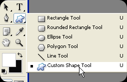
Now, select the Custom Shape Tool:Custom Shape tool

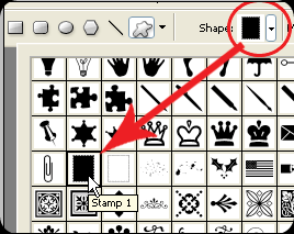
And from the Custom Shapes list, select the postage stamp:

Stamp Shape

Fill PixelsOut of the 3 choices in the upper left corner of your screen, click on the 3rd one (fill pixels):

Create a new layer: SHIFT + CTRL + N (press OK)

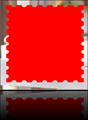
Stamp on PhotoDraw the postage shape on the new layer(no matter the color):


Right click the new Layer in the Layer Palette and then Blending Options: Blending Options

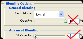
In this window, first thing to do is move the second slider(Fill Second Slideropacity) to zero:


CheckboxesNow, check the Bevel and Emboss, and Drop Shadow boxes to the left:

Now it’s time to play with the settings. Depending on the size of your photo, you are going to need different settings, but I’ll tell you what settings to keep in mind.


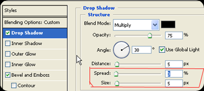
Click on Drop Shadow, and you will get it’s settings. Play with the Size and Spread sliders ‘till you get what you want:

Spread and Size

You could also mess with the Bevel settings, but we will skip that for now, so just click OK.

Magic WandSelect the Magic Wand Tool, and click out side the Click outside of stampstamp shape:


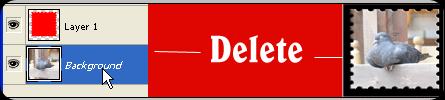
Select the photo from the Layer Palette, and press DELETE:image

  That would be it! You might want to change the background color, so with the outer part still selected, take the Paintbucket tool, with white color, and color it in.image

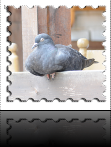
You don’t have to stop here. Invert the selection with SHIFT + CTRL + I(so the photo is selected), go to the filter gallery: Filter – > Filter Gallery, and choose an effect. I chose the Cutout filter, and added some text:

image

That’s it. There are some variations on the subject, and I would love to know what you would change to suite your needs, so feel free to write a comment on the subject :)

Saturday, December 12, 2009

#38 Photoshop won’t change from Hand tool!

This has happened to me today, of course at the time when I urgently need Photoshop(in my case CS4), and I found the solution. If you Googled this and wound up here searching for the fix to this, chances are the problem will fix itself by the time you are reading this, if not, try the trick below:

If you Photoshop is stuck on the Hand tool, try this:

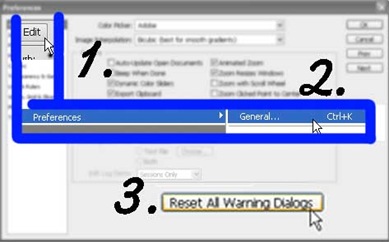
HandToolStuck

Edit – > Preferences – > General – > [Reset All Warning Dialogs]

Problem should be solved now!

Saturday, November 21, 2009

#37 Links from TweetDeck not opening in Opera?

Not my usual forte, but I had this problem, and I just had to share the solution with you!

Windows XP has this section for setting the default browser on your machine, and that might be causing you trouble. For the sollution, got to your Control Panel, and then proceed to Add/Remove Programs.

addRemove                                 setProgramDefaults

After that click on Set Program Access and Defaults.

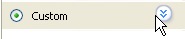
Custom

Click on the double down arrow next to the Custom option to open up the settings that we need.

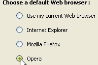
Default

Under the menu for Choose default Web Browser select Opera(or any other browser you want). Don’t worry about the checkbox on the right.

You are done! This has worked for me. I have seen reports that you  might need to restart your PC for this to take effect, so try that if it doesn’t help!

Monday, October 12, 2009

#36 Give Your Photos Power, in a few clicks

Have you ever wondered how other photographers have powerful colors in their photos? If you thought it’s all in the camera, you are way off track! Read on to find out the truth behind these photos…

Decide which photo you want to empower and open it in Photoshop (i think this works in all CS versions).

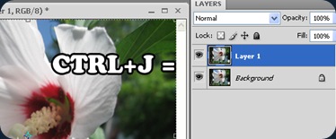
1) Duplicate the background layer (the only layer):
overlayFlower1

2) Apply a Gaussian blur to the new layer, to such an extent that you can’t make out the details, but you can make out the shapes:overlayFlowerBlur
Click on the picture for a better view.

3) And finally change the upper layers blending to Overlay:

overlayOverlay And you’re done! This particular photo looks like this:
overlayFlower

Now that you know this simple solution, you can add other tricks to the same photo, like using this as a border, or applying it only to the background.

You can diminish this effect by reducing the opacity of the upper layer.

And remember, this was taken with a 100$ camera, so I am pretty sure you can do it with whatever you got ;)


Flaky Collector by ~NebojsaC on deviantART

Friday, July 17, 2009

#35 Easy Do-It-Yourself Frames for Photoshop, Brush Shapes

This is a quickie. To get you started:

1) Open the image you want done

2) Make a copy of the Background Layer, and delete the original background layerLeaf Frame1

3) Make an New Layer beneath the picture(check image for consistency)


4) Hold down ALT and click on the line between the layers(as shown on the image below)

Clipping1

Your layer should move slightly to the right like so:

Clipping2 

You should now have a blank screen to work with. Now, take your Brush, set it’s Size and Hardness, and start painting on the empty layer!ClippingFinal

My tip Is to use different shapes for your brushes for some interesting effects. For starters, try the built in leaf brush and you might get something like this(image on right).

For an added frame effect you can always add Stroke borders on your layer, and a background layer with a color or gradient on the bottom.

This has many possibilities, and try combining with other tricks you know for some exciting results.

You could also look for more Brush packs for Photoshop. A good place to start is http://www.brusheezy.com/.

Monday, July 13, 2009

#34 Easy Do-It-Yourself Frames for Photoshop, Photo Borders

The simplest frames are often the best ones. Especially if you’re in a hurry, or don’t want to lose focus with the photograph you’re framing.

For this particular tutorial, a good choice of photograph would be one where the photo has one or two dominating colors. A good example is a wedding photo, where the dominating colors are the colors of the bride’s dress and bouquet, but anything will do. My choice:

beeThe obvious colors here are that purplish-blue  flower and the orange-yellow bee. The photo(by my standards) isn’t bad on it’s own, but suppose you want to add a bit of style to it.

Okay, now go to Image –> Canvas Size (Alt + Ctrl + C), and set it like so(click for a close up):

CanvasSize

So you just change the units to percent, set it to Relative and type in 6 (or any smaller number) for the size. For the Canvas extension color you click on the color box next to, and click on your image. Your mouse pointer turns into an eyedropper tool, and you choose the color for your border. This way you use the color from you picture. Click OK for the color picker, and OK again for the Canvas Size. I got:

bee2

The first part is done. Now, repeat what you did with the Canvas Size, but change the size to 30 this time, and pick another dominating color from the photo.

If you are not happy with the color picker, you can choose it manually.

So basically you make two different sized bands around the photo.

bee3Looking at it now, I probably should have used a darker purple. But maybe it’s just my BBB(black blog background).

Variations on this subject can include, but are not limited to:
-using more(or less) than 2 borders/colors
-different sizes, like making the first border thicker
-adding the Vignette effect beforehand for interesting results
-and so on…

Once you’ve read through this, you will realize that the longest part of this tutorial is looking for, and opening the photo, while the rest just zips by. Have fun with it!

Sunday, July 12, 2009

#33 Easy Black and White photos with some colored areas

Ok, keeping it short and simple. Open the image you want to work with in Photoshop. Press CTRL+SHIFT+U to make it black and white(or Image->Adjustments->Desaturate).

BWButterfly

Now, all that’s left to do is select the History Brush tool(shortcut Y) and be sure to not select the Art History Brush by mistake.

Now just go over the areas you want to get their color back and voila:

BWButterfly2

If you accidentaly color too much of it, you can use the color replacement tool, and set it to Black, to turn areas back to black and white.

An importatn thing to note is that the Desaturate command should be the first and only modification prior to the History Brush tool. If the image was rotated, then the History Brush won’t work. So, if you come across this problem, then firstly color it, and then rotate it, or rotate it, save it, and open it again.

That’s it. Learn to control the brush size and feathering for the best results, and even opacity finds it’s use here. Have fun and enjoy.

Tuesday, April 7, 2009

#32 Up close and personal, shoe-shine perspective

This can be treated as a continuation to the macro photography post. Also, on a side note, I’ve read somewhere that posts are better when left shorter. Which makes sense in this micro blogging boom that we see today.

IMG_2154

The above photo shows how NOT to do it. First of all, turn off the flash and get closer!

A good way to make your macro photography stand out is to get real close, from a shoe-shine perspective.

Get the camera low and close to the subject, and shoot upwards:

IMG_2156I will just try and keep the posts as short as possible, for experimentation purposes.

Sunday, February 22, 2009

#31 Fix Up Your Makeup In PhotoShop

If what the current internet trends are any indication, then you can’t have a photo of you on a social site without at least a little retouching.

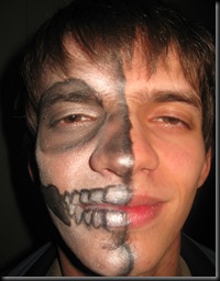
Well, for starters, you need a photo to fix up. This is a guy writing this, so I won’t be working with what you would expect for “makeup”:

MakeUp1

I was amazed how this turned out, I wouldn’t of changed it, but it will be great for today’s trick.

The white isn’t completely white, and the black isn’t completely black. We have some smudges here and there, and some flash reflection to get rid of.

The first thing we should do is fixing the glow from the camera’s flash. We are going to use Color Curves to help us single out the flashed parts.

Make a copy of the one layer you have, and put it above the main layer. Now, select that new layer and open the color curves tab.

MakeUp2Once you make the curve to look like mine(see above), spotting the patches with too much light is easy. One of mine is above the eyebrow and there are 2 more on the lips, and one on the nose.

Use any selection tool to select the patches that need some flash reduction, and feather the edges of your selections.

Now hide this layer by clicking on the eye icon next to it on the layer window. Select the visible layer and open up the Curves again.
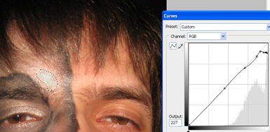
MakeUp3This way we can reduce the whiteness so we can continue to work with the image, but salvaging completely the color that was under there is a different thing. This is why you have to mind how and when you use your camera flash.

Next step: Fixing the white and black colors.

Since they are simple black and white colors, we can use the Dodge and Burn tools, but if it were any other color, we would need to use the brush. This is why I am going to show you how to use the brush tool, so you can fix any faded color.

Select the Brush tool and the color you need. I will start with a white, and continue with a black brush.

MakeUp4

Set the Brush opacity to about 30%, and start brushing up the photo. When working around your hair, lower the opacity, and when working with nooks and crannies reduce the brush size.

The same goes for any color.

Take your time, and fix it up as you see fit.

MakeUp5

MakeUp1


The before and after shots. That’s one way to fix up your make up. I could of done the lips too, with any color available.

So the next your makeup is faded on your photos, just spruce it up in PhotoShop.
Friday, February 13, 2009

#30 Make Hearts Quickly in Photoshop

With Valentines day coming up tomorrow, I thought that this was a more then appropriate post to make. Maybe it will save someone the hassle of using worn-out templates, and done-to-death pictures.

Ok, start open a new page in Photoshop, with the size you want and the background color you want, and let’s get started.

Select the pen tool and just punch in these points, with the tool shown selected(close the path by clicking on the first one you made):

Heart

With the Pen Tool selected, hold down the CTRL key, and click on one of the edges to get the points to show(left).Heart2 Now hold downHeart3 ALT and click on the point and drag away from it, and see what shapes you get(right)

Repeat this for all the points except the two ones in the middle. Curve it any way you want of course.

Enter the layer style menu, and check the Bevel and Emboss tab, and increase the size to get a nice rounded shape:

Heart4

No Valentines Day heart would be complete without the letters carved in right?

Make the text that you want, and give it a color that you want and set it’s layer style as follows:


Heart 5Again, the possibilities are only limited by your imagination. A couple of quick tricks: try using a gradient color, different Bevels, add this to a photo of the two of you, and try unconventional heart shapes. Experiment!

She/he will appreciate anything you spend some time on for her/him, so don’t keep it too simple.

Thursday, February 12, 2009

#29 Modeling An Asteroid In Cinema 4D

As always, there are at least 2 ways to go about doing this. One way is modeling it polygon by polygon, but that’s kind of a stretch, so we will be using an easier way, in accordance with the tradition of this blog.

Start off with a sphere, and make it editable(of course after you have set the subdivision count). Create a new material, so we can start working with this.

For the color, you should ask yourself what does an asteroids color look like? I don’t really know, but I can imagine it depends on where it came from, but I use the standard mud/rock color mix.

In the color tab set the color to Noise, and choose which colors you see fit. A mix of 2 shades of brown might work, or you could add some black to it. Your choice. You might even want to choose different noise types. For experimentation purposes, I chose Zada:

Asteroid1Now take check the Displacement checkbox, and in the Displacement tab give him a Noise color again. Leave the colors black and white this time, and increase the Global Scale to 500%. Once you’ve done that, go back to the Displacement tab, and increase the height as you see fit.

Turn of the Specular checkbox, so you don’t have the shine. In the end, you might want to put it in a HyperNURBS object, but I only recommend this if you won’t be using too many of these in a scene.

Asteroids

The results vary depending on what colors, types of noise, and sphere size you use, but if you know exactly what you need, then you’ll probably find a way to make it. You are now one step closer, to making your own Asteroid field.

Monday, February 9, 2009

#28 Morphing Letters Animation in Cinema 4D

You don’t always have to move the letters you have on your screen to replace them with other letters. With this technique you can make your letters change their shape into other letters. You can also do this with words, once you get the hang of it. It would be a good idea to check out my post on Morphing Setup with PoseMixer, to make it easier to follow this post.

To get things started, we have to make sure that the first letter we will use has enough points to be able to morph into every other letter we use. MorphLetter

I am going to start with the letter “B” because those two holes, which we will be able to use. Create a Text Object, and make it show the letter “B”. Make it Editable and put it under an Extrude Object.

MorphLetter2We will make it able to easily morph into the letter A, B and C. Make the following setup in the PoseMixer Tag. All the spline objects are copies of the first spline. Make sure to rename them the same way as on the picture( to the left).


Now that you have the PoseMixer set up, now you can proceed to shape the letters A and C. Hide all the other objects one working on one of the letters, and work with the points. Remember not to add or delete any of the points. If you have some extra points, either align them with the others, or scale them down. The process of making the letter A:

MorphLetter

You can make as many letters as you like, and add them all to the posses list at the PoseMixer tag.

All you have to do is animate the sliders for the corresponding letters, and you got your self morphing letters.

MorphLetter2

Depending on how much time you have on your hands, and how perfect you want it to be, this might take a while. You can also do this with entire words, so it can actually be quiet interesting. You might even want to leave the imperfections, or make graffiti-like letters. I was thinking of making an entire song like this. It might take a while, but it can look great!